Terraced house metamorphosis
The existing, extreme range is a single-family house from the 1970s burdened with functional and usability shortcomings, resulting from the housing standards of that time, years of layers, and modifications. The Investors intended the house to become a comfortable, spacious, modern, and friendly space for an energetic retired couple. The plan, therefore, envisions not so much a correction but a true revolution both inside and outside.
The Investors’ experiences and their specific needs served as the starting point for the initial work, but with the freedom and trust provided, they were not limited; rather, they provoked unconventional solutions. Technical possibilities of the building itself and the unfavorable proportions of existing spaces were significant challenges.
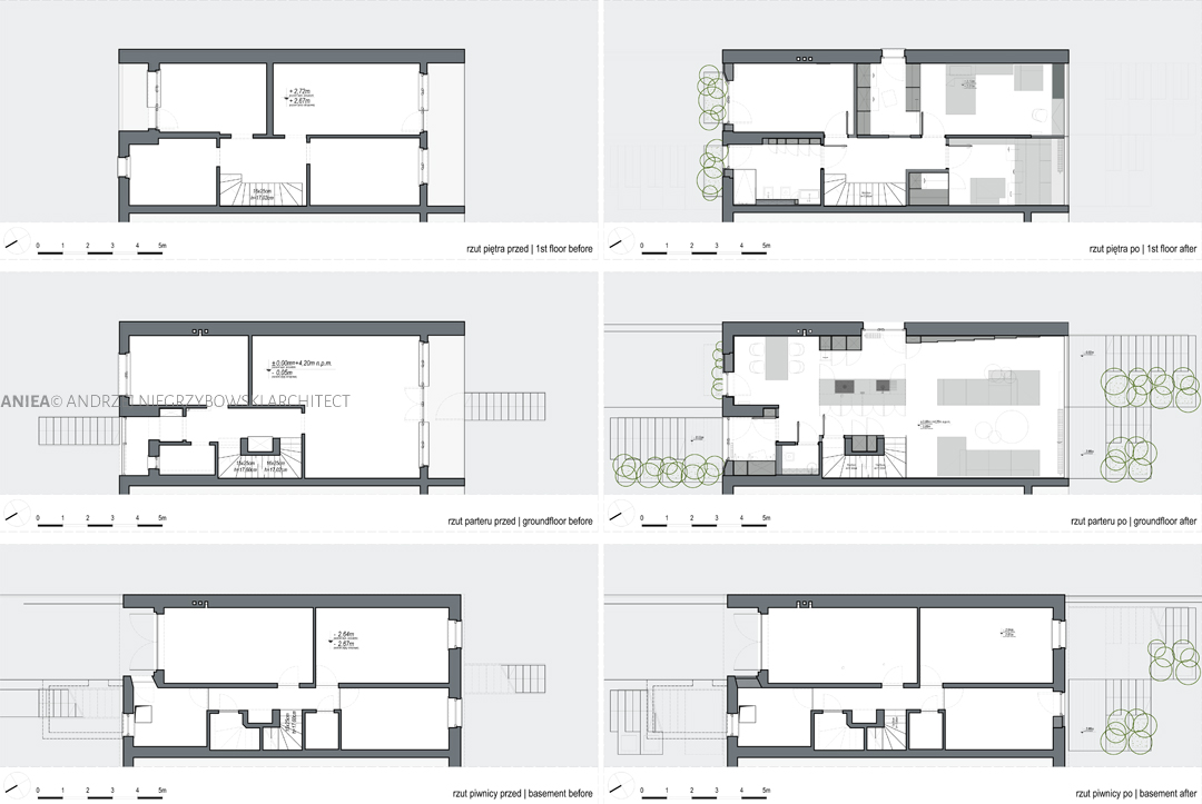
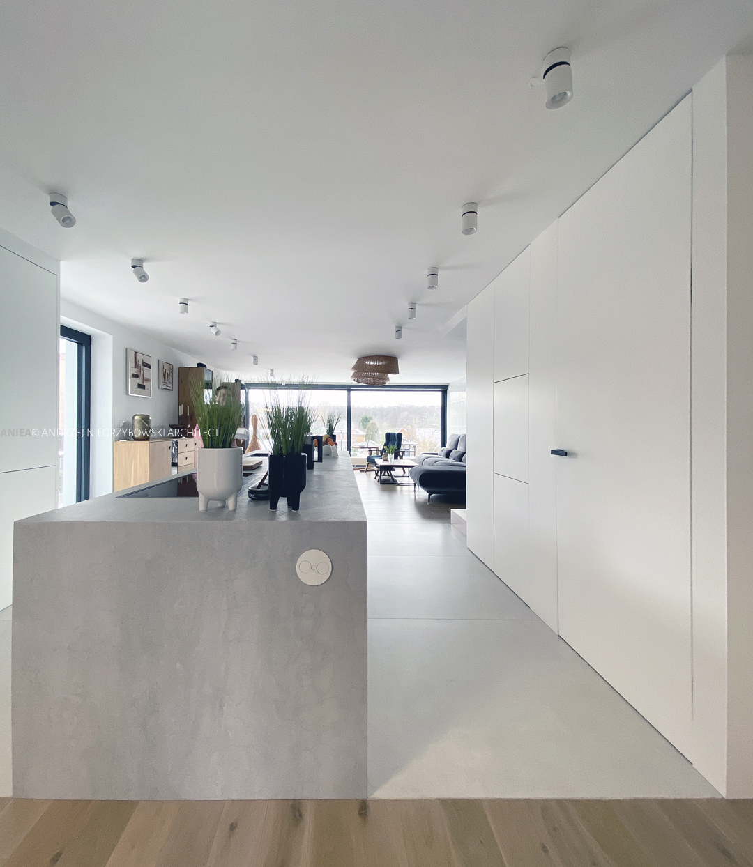
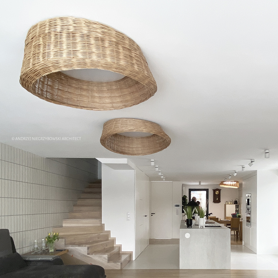
From the beginning of the concept, a long, insufficiently lit central section of the range’s plan and the unusually low ceiling of the ground floor posed a serious challenge. The existing division of this floor did not reflect its scale, creating dark areas, cramped and unfriendly interiors, and corners that could be considered wasted space. Removing almost all partition walls and incorporating the loggia into the outline of the open ground floor space allowed for a significant opening, providing breath and enabling visual contact between people in the kitchen, dining room, and living room. A significant move, enhancing the possibilities of arranging the ground floor, was adding a window to the gable wall and significantly illuminating the central section of the house. These measures made it possible to place the kitchen between the living room and the dining room, in the middle of the plan, as a central element, giving it the status of the heart of the home instead of a cramped space in the corner, as it had been until now. A large, comfortable, two-sided island with wall-mounted furniture, adequately illuminated by the new window, encompasses a full range of functional uses. The space previously occupied by the kitchen now houses the dining room, where a regular window with a windowsill has been replaced by a floor-to-ceiling window.
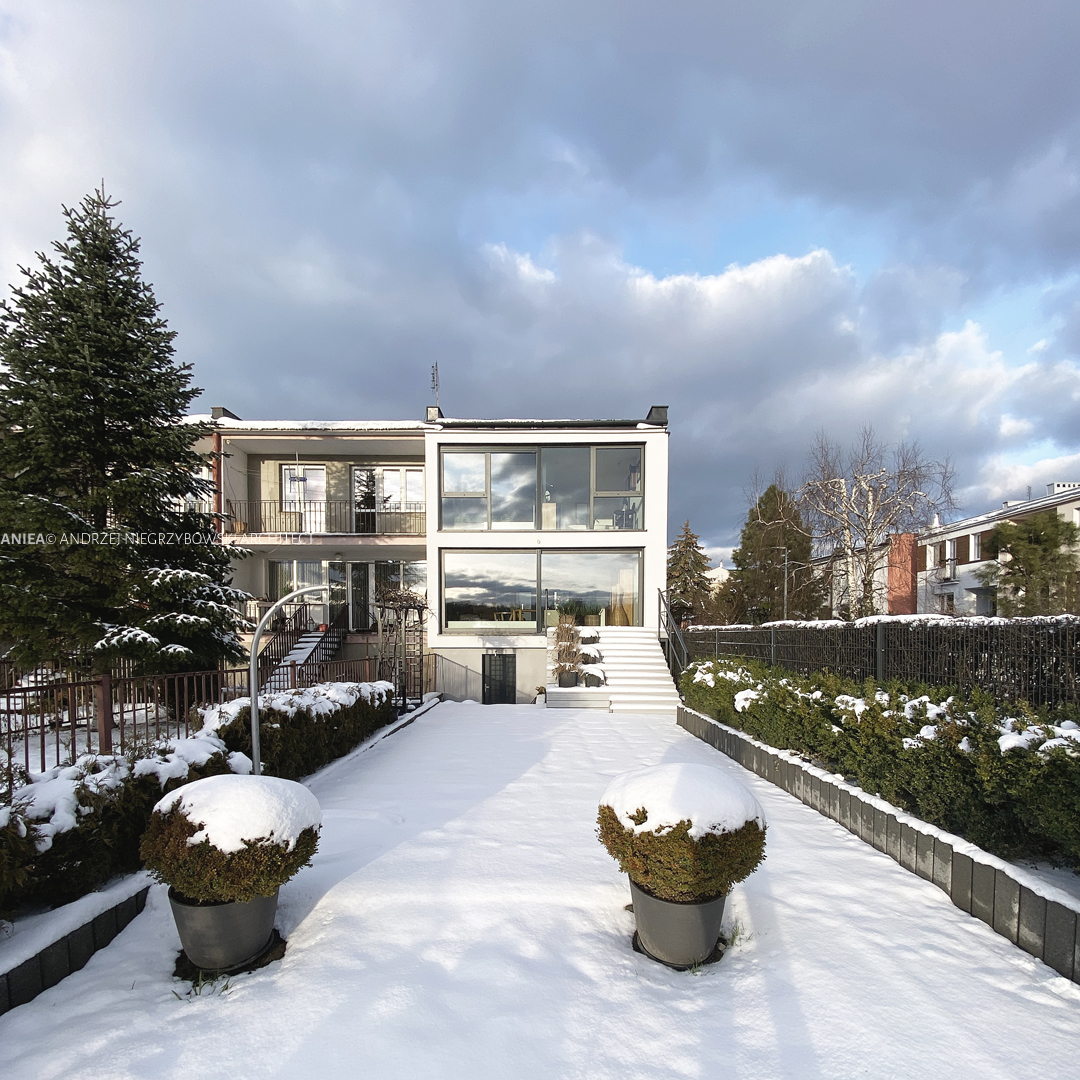
The living room, visually and functionally connected to the kitchen and, in the long term, also to the dining room, was expanded by incorporating the existing loggia and obtaining glazing across the entire width and height of the gable wall. This window provides a perspective on the backyard garden and green areas in the distance. The exit leading to the newly designed terrace goes through sliding, massive glass doors.
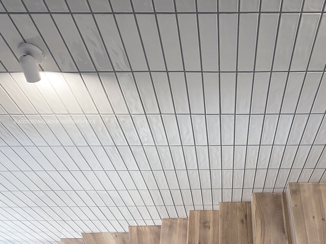
The entire ground floor, being an open space, has a unified color scheme and repetitive forms of accessories and details. In line with the immediate surroundings, such as the beach, dunes, coastal forest, or nearby wetlands, the color scheme is maintained in whites, beige, delicate grays, sandy wicker color, whitened oak, or upholstery fabric. The color composition is complemented by various shades of green, present as art or real, living plant colors. For increased ease of use, the majority of furniture is custom-built, and freestanding elements have been reduced to the necessary minimum to limit cleaning time and visually “calm down” and organize the space. Most wall decorations, such as built-in furniture and brick, are installed to visually raise the room vertically. Additionally, oak veneer, painted, and lacquered with a gradient transitioning from the natural color of oak at the bottom, near the floor, to pure white and the color of ceilings and walls, adorn most elements. Suspended ceilings and painted ceilings are finished with semi-matte paints, similar to the brick-patterned wall (brick from the demolition of partition walls will be used whenever possible). To optically shorten the corridor, looking from the kitchen and the main entrance, the built-in furniture on the left wall was designed stepwise, with front widths of varying geometry, i.e., the further from the observer, the wider the front. This simple measure aimed to eliminate the negative impression of an overly long corridor, which is further intensified by the low-hanging ceiling of the ground floor. This impression is also helped by the direction of laying the floorboards.
The color scheme of the ground floor is replicated on the upper floor, where, according to the new arrangement, three bedrooms, a wardrobe, and a bathroom are located beyond the staircase. Each of the bedrooms, for users and guests, serves as private oases reflecting the characters of their users. Due to unfavorable proportions, such as the elongated tract and the Investors’ habits, the bedrooms were optically divided into two sections. Therefore, Mrs. Investor’s bedroom consists of a sleeping area, bright, maintained in shades of broken white, beige, with a soft texture of walls and ceiling, and a dark area located under the window, serving a recreational function with a vanity in the form of a shelf across the entire width of the room and built into the countertop a pot for orchids. The arranged room aimed to add a slightly clearer contrast but also optically shorten the corridor by cutting off the color of the room with the color of the section. The bedroom connects directly to the spacious and naturally lit wardrobe. The new window in the gable wall makes the wardrobe no longer a traditionally dark, cramped space but a comfortable, illuminated, and functional room.
Mr. Investor’s bedroom, on the other hand, utilizes a similar color scheme but this time refers somewhat to youth and childhood. The bed is designed as a mattress placed on a platform near a large window. Associations with a treehouse with a view of the surroundings or a boyish hideout are entirely justified. This unique observation point is also an ideal place to watch TV, listen to music, or enjoy a book. The platform allows hiding drawers and compartments for small items, books, etc. This bedroom is also equipped with a separate wardrobe.
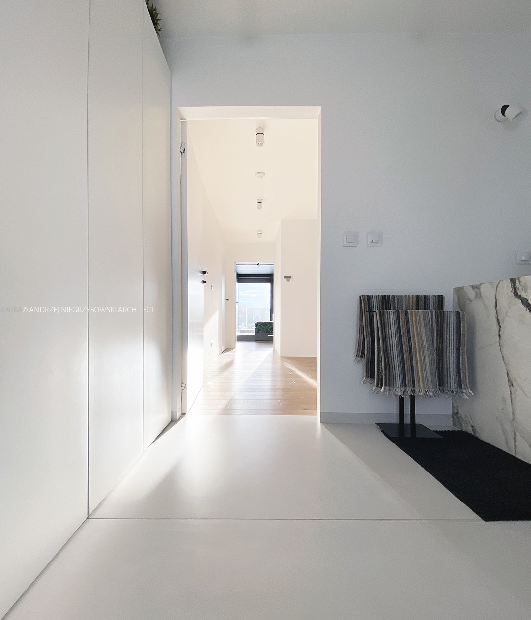
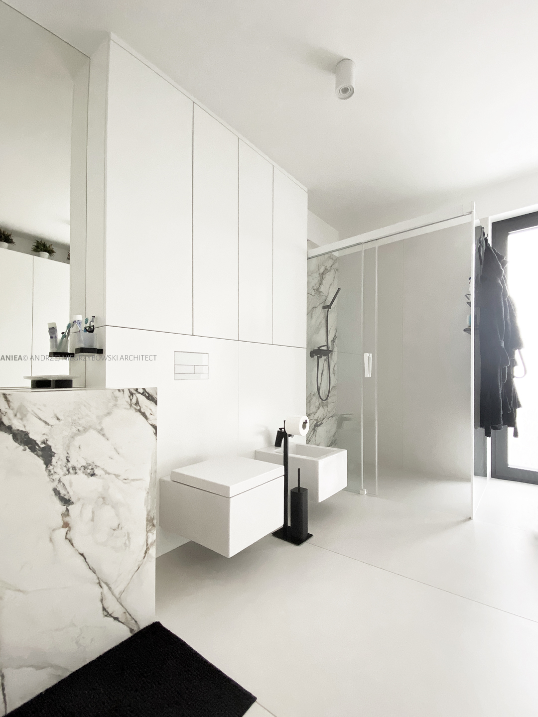
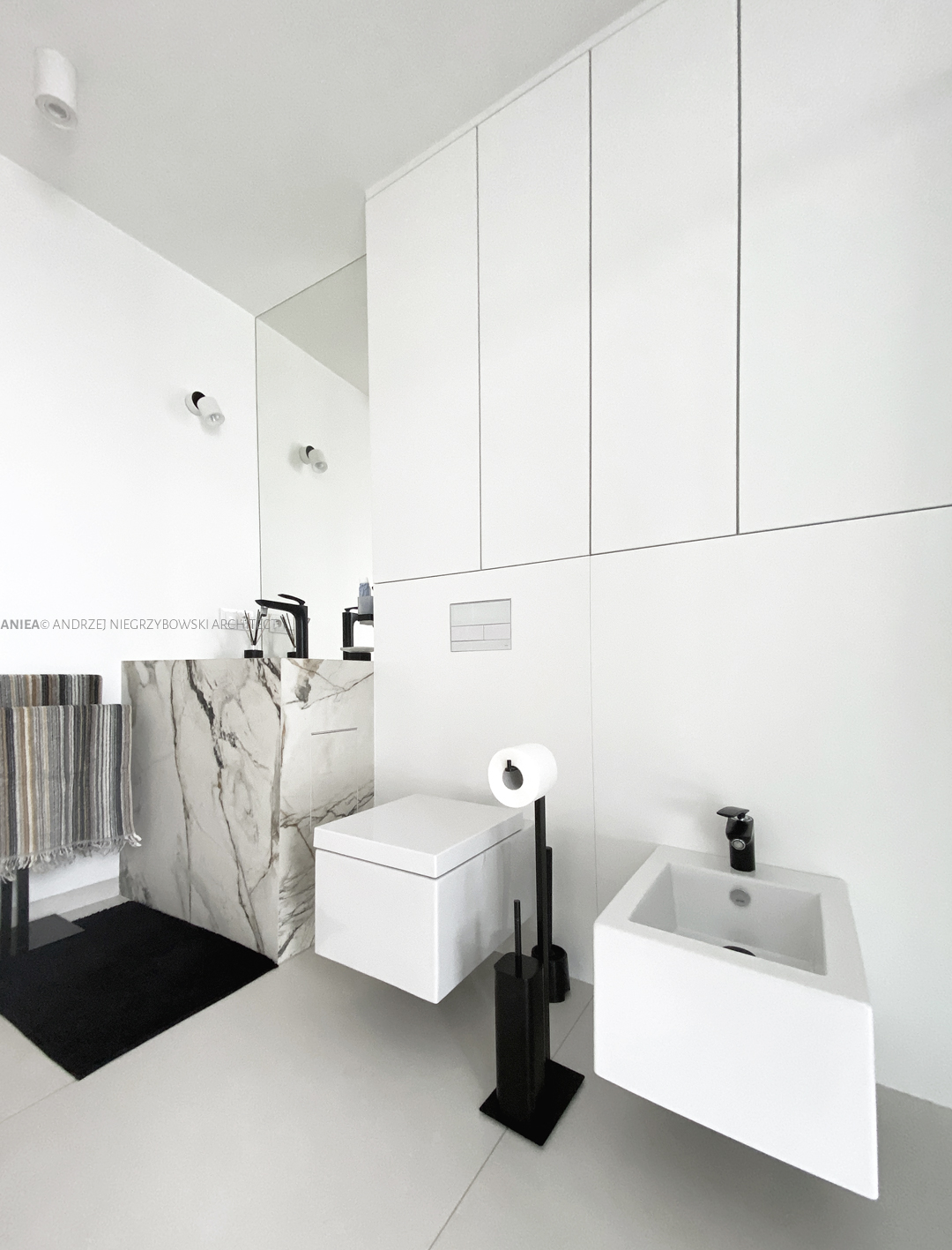
The bathroom is a minimalist, spacious space without architectural barriers. The dominant color is pure white, accompanied by a whitened shade of architectural concrete, the natural color of Rain Forest Brown stone, and reddish accents. Functionality and ease of use were crucial here while limiting forms and details. The large window without a windowsill is intended to allow more eastern, morning light into the interior.
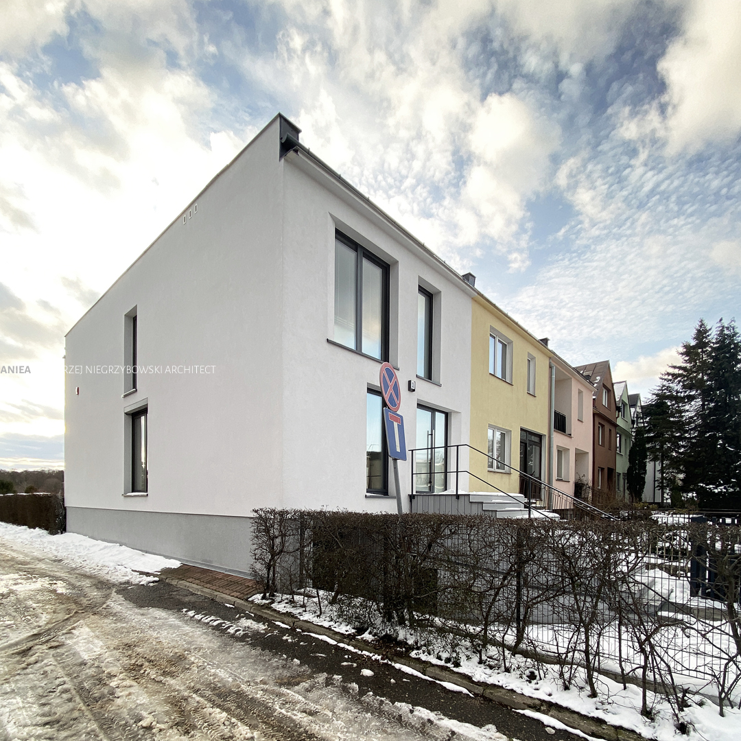
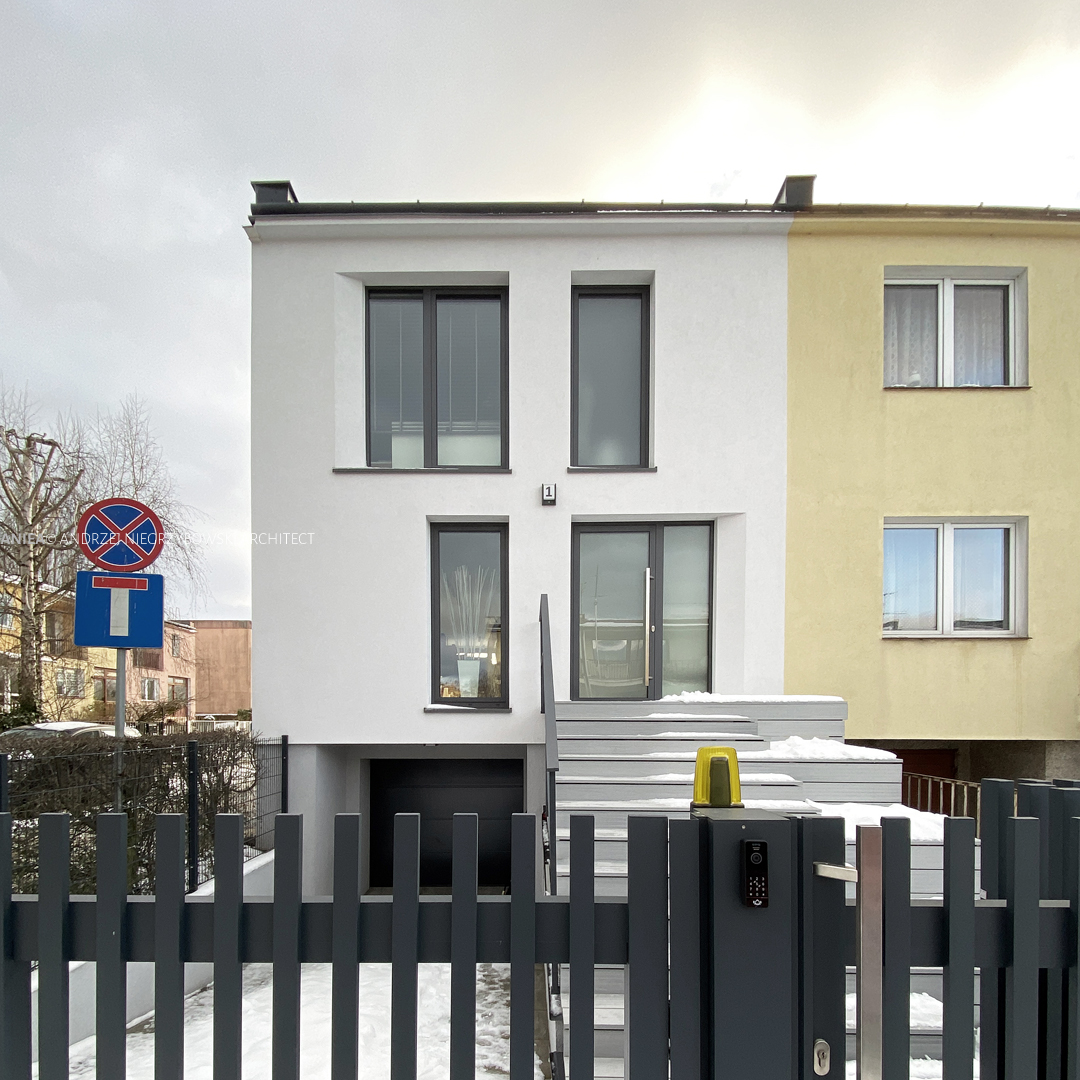
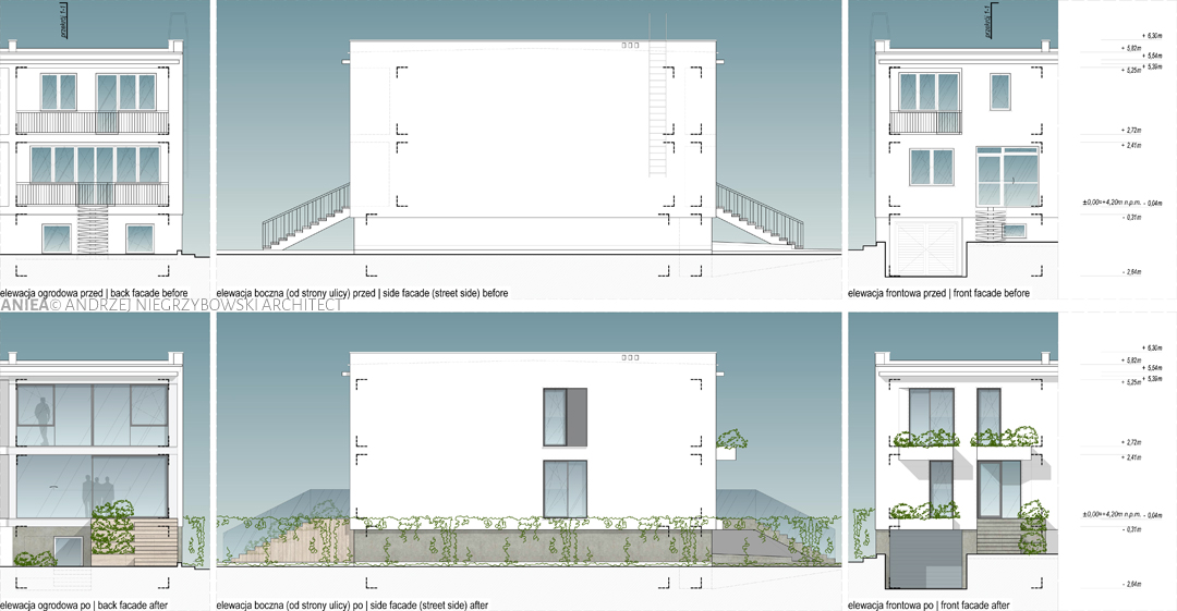
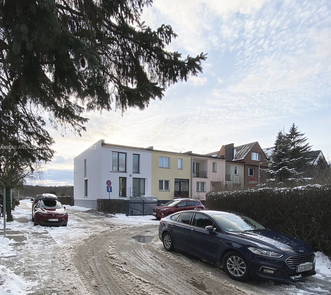
From the outside, despite new windows and changes in their geometry, the house tries to continue the rhythm and repeatable division of both the front and garden elevations. The principle of asymmetry in the front elevation and the alternation of larger and smaller window openings has been preserved. Balcony planters, enriching the elevation drawing and introducing light and shadow effects, as well as ubiquitous greenery, constitute an addition. These elements also serve as a roof for the newly designed entrance stairs to the house. The greenery growing in the planters is also an element influencing the interior. Plants will be well visible through windows planned to the ground level, with the planters serving as an extension of the floor.
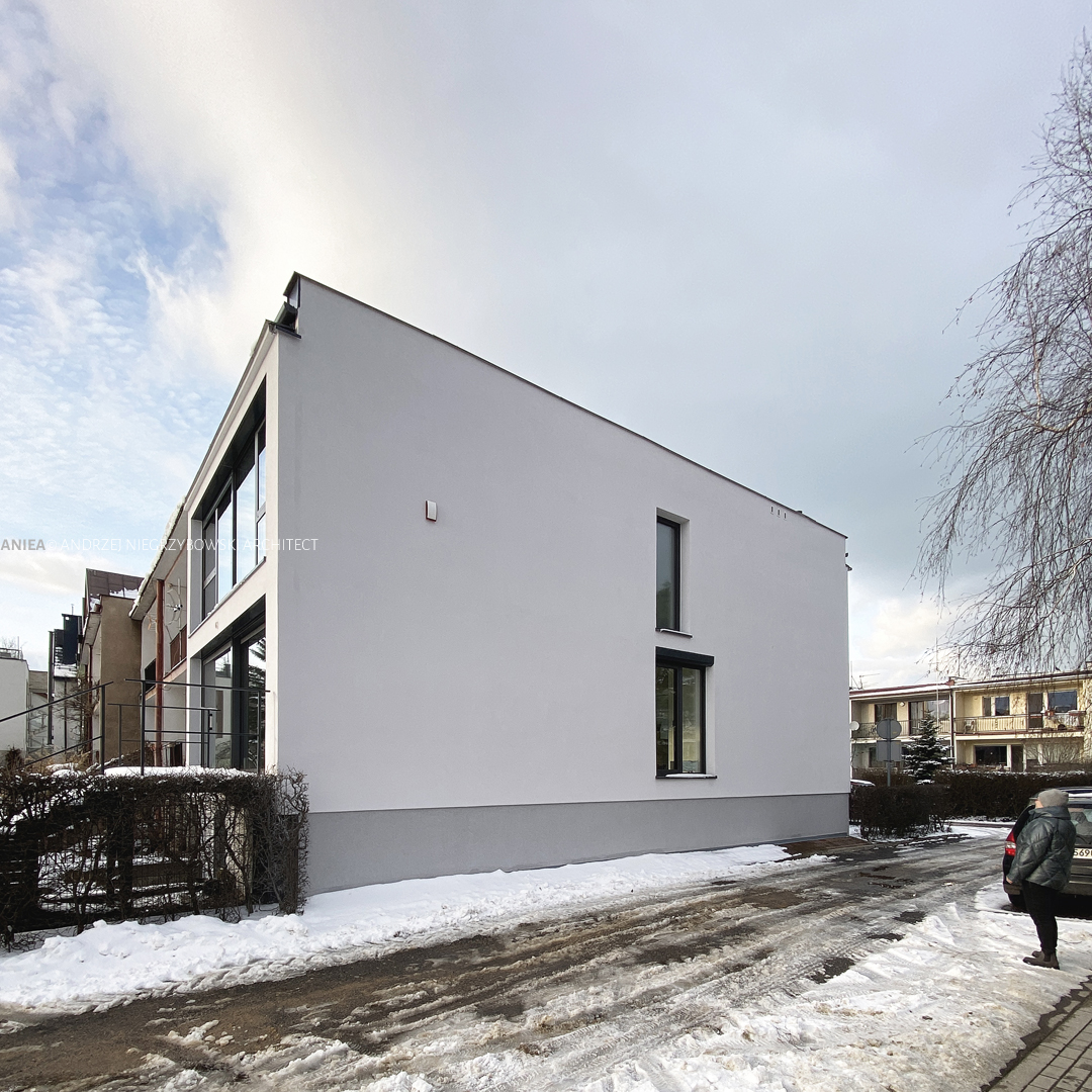
The gable wall, devoid of any elements so far, except for the ladder leading to the roof, gains two new windows arranged one above the other. Along with the greenery surrounding the house and climbing on the beams stretched on the elevation, it beneficially influences the quality of the small urban interior and positively changes the visual perception of the entire row.
Project: 2020;
Status: Complited 2021-2023;
Usable area of the house: approx. 145m2;
Location: Gdańsk, Poland

